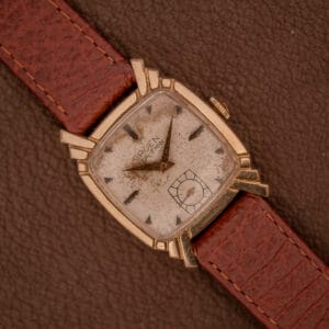
The Doxa Grafic is one of those watches that makes you do a double-take. In a world where most mid-century dress watches played by the same rules, applied indices, dauphine hands, round cases, Doxa had the audacity to throw out the rulebook entirely and create something that looked like it belonged in a graphic design studio rather than a jeweler’s window. And that, in a nutshell, is exactly why collectors are increasingly paying attention.
Doxa, founded in 1889 in Le Locle by Georges Ducommun, is a brand most enthusiasts associate with their legendary Sub diving watches. But what fewer people realize is that throughout the 1950s and 1960s, Doxa was also producing some of the most inventive and design-forward dress watches in the Swiss industry. The Grafic line is arguably the pinnacle of that ambition. The name says it all: this was a watch conceived with the eye of a graphic artist, not a traditional watchmaker. Its design language owes as much to the Bauhaus movement and mid-century modernism as it does to Swiss horological convention, and the result is a timepiece that feels startlingly contemporary even decades after its creation.
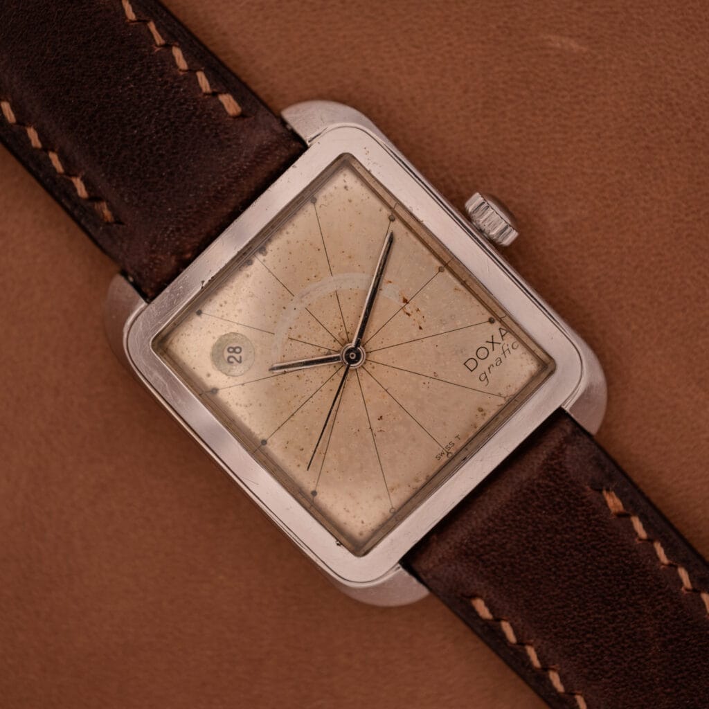
This particular example is a study in radical minimalism. The square case, with its gently radiused corners, provides a bold canvas for what is truly one of the most unusual dials of its era. Instead of conventional hour indices, Doxa used fine engraved lines radiating outward from the center of the dial like a sundial or a compass rose, each terminating at a tiny dot. There are no applied markers, no numerals, nothing to distract from the pure geometry of the design. It’s the kind of dial concept you could imagine hanging in a mid-century modern gallery alongside the work of Dieter Rams or Max Bill. The date window sits unconventionally at approximately 10 o’clock, further reinforcing the sense that this watch followed its own rules.
The dial on this example has developed a rich, warm tropical patina that has transformed the original silver surface into something resembling aged parchment, with an even freckling and toning that gives the whole piece a beautifully organic, almost celestial quality. The engraved radial lines remain crisp and legible throughout, creating a fascinating contrast between the precision of the original design and the natural evolution of the surface over time. To us, this is a dial that has genuinely improved with age. The date aperture at 10 o’clock shows some oxidation around its edges, which is consistent with the overall story of the watch. The slim lance hands retain their polish and provide clean legibility against the warm dial surface.
The stainless steel case is in solid condition, with honest surface wear along the flanks and case back consistent with decades of use. The proportions remain sharp, and the profile is admirably thin for a date watch, sitting close to the wrist with a sleekness that modern square watches rarely achieve. The crown is intact and functional.
For the collector who values design above all else, the Doxa Grafic is a genuinely rare find. It’s a watch that starts conversations, that makes people lean in and ask “what is that?” It bridges the gap between horology and industrial design in a way that very few mid-century watches managed, and at its current market positioning, it represents one of the most interesting and underappreciated design statements in all of vintage watchmaking. This is not a watch for blending in. This is a watch for someone who understands that the most interesting things in this hobby often come from the places you least expect.