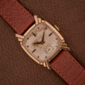
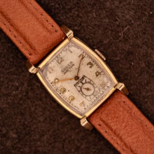
The thing that stops us on this particular Gruen Veri-Thin is what is happening at the lugs. Most fluted-shroud designs of the late 1940s settled for two or three vertical ridges; this Ref. 527/420 packs in roughly nine tight bars of gold-filled scallop across each end of the case, like a small architectural detail you might find on a 1930s elevator panel rather than a wristwatch. To us, it is one of the more visually committed cases Gruen put under the Veri-Thin name, and it makes a 28mm cushion read with the kind of confidence usually reserved for a much larger watch.
The Gruen Watch Company sat in a singular position in American horology by the time this piece was built. Founded around Dietrich Gruen’s existing Cincinnati operation and run thereafter by his son Fred, the company was, by the mid-1920s, the single largest watchmaker in the United States by total sales. The shape of the business was unusual for the era: movement design and manufacture happened at the Precision Factory in Biel, Switzerland, and the finished movements were then shipped to a Cincinnati landmark the family called Time Hill, where cases were sourced, watches were cased and timed, and dials were finished for the American market. That transatlantic structure is exactly what the inner caseback engraving on this watch records, with “Cased and Timed by The Gruen Watch Co.” reading like a quietly proud signature of that working arrangement.
Inside is the Gruen caliber 527, a 17 jewel hand-wound movement carrying Gruen’s Precision grade, which was the upper tier of what the Biel factory produced for the brand’s mid-century wristwatch line. The Veri-Thin designation itself goes back to 1904, when Dietrich Gruen patented a rearrangement of pocket-watch components that allowed the movement to be made noticeably thinner at the edges without losing rigidity, and the engineering principle migrated to wristwatch calibers like this one in the late 1930s. The movement photograph here shows the bridges in characteristic orange-red lettering reading “GRUEN WATCH Co PRECISION SEVENTEEN 17 JEWELS” with the Veri-Thin signature crossing the upper bridge, the ruby jewels set in polished gilded chatons, and a fine perlage texture worked across the plate surfaces rather than the more decorative striping you sometimes see on dressier mid-century calibers. The balance is visible at the right of the frame with its regulator arm intact, and the train wheels read clean and well-kept.
The case itself is the architectural piece of the story. The cushion silhouette is rendered in 10K gold filled across the bezel, lug shrouds, and outer flanks, married to a Guildite stainless steel mid-band and snap-on caseback. The fluted lug shrouds extend horizontally across each end of the case where conventional lugs would be, presenting that row of tight gold scallops we mentioned at the top of this listing, and the spring bars sit hidden underneath them in a way that lets the strap visually disappear into the case profile. The outer caseback is signed “Gruen Guildite Base Metal” along its lower edge in the small block lettering Gruen used through this period, and the inner caseback carries reference 527/420 alongside the case serial 5846674. Dimensions come in at 28mm across the cushion, 36.7mm lug to lug, and a 16mm lug width, all of which read genuinely small by modern standards but proportionate and correctly weighted for an American Gruen Veri-Thin of this configuration. Light scuffing across the gold-filled flanks and a clean brushed surface on the steel back read to us as honest mid-century wear rather than restoration work.
The dial is where the period really sings. A silvered cream surface has aged with a slightly warmer tone gathering in the center and a cooler, lighter cast holding around the perimeter, the kind of soft tonal gradient that develops on factory-original Gruen dials of this era and tells you the surface has never been refinished. Full Arabic numerals one through twelve are printed in gold across the dial in a stylized, characterful Art Deco font where the 2 swoops, the 5 squares its shoulders, the 9 closes its loop with a gentle curl, and every numeral feels hand-drawn rather than generic. The GRUEN signature stacks above VERI-THIN in bold dark lettering below twelve, with PRECISION printed in smaller text just above a subsidiary seconds register at six o’clock, the sub-dial itself worked with a crosshair pattern over a fine concentric ring and a tiny gold seconds hand pinned at center. The handset is a pair of slender gold lance-style hour and minute hands, tapered to fine points and catching just enough light off the dial surface to read crisply at a glance. There is no lume anywhere on this dial, which is exactly what it should be for a 1940s American dress Gruen and removes one of the more common entry points for restoration shortcuts.
We have set it on a padded brown leather strap with white contrast stitching, a pairing that picks up the warm gold tones of the bezel and the cream of the dial without leaning either too dressy or too casual.
Serviced in-house at OTTUHR and backed by our 2-year mechanical warranty. For the collector who appreciates the architectural side of American case design at its mid-century peak and wants a watch where the case detail does the talking rather than the dial, this Ref. 527/420 is, to us, a wonderfully characterful entry into one of the more visually adventurous corners of late-1940s Gruen Veri-Thin design.